LOOKFANTASTIC brand refresh
ART DIRECTION / DESIGN
Refresh of the LOOKFANTASTIC brand. Working with the whole creative team & brand teams to deliver an exciting reintroduction of the brand, enabling the brand to work hard and resonate with it’s customer base.
This was an extensive process, with the redesigning of functional elements such as site & email, research into the brands key target audiences, as well as lots of amazingly creative video & stills shoots ranging from product to model & the more playful swatch creation to really define the brand.
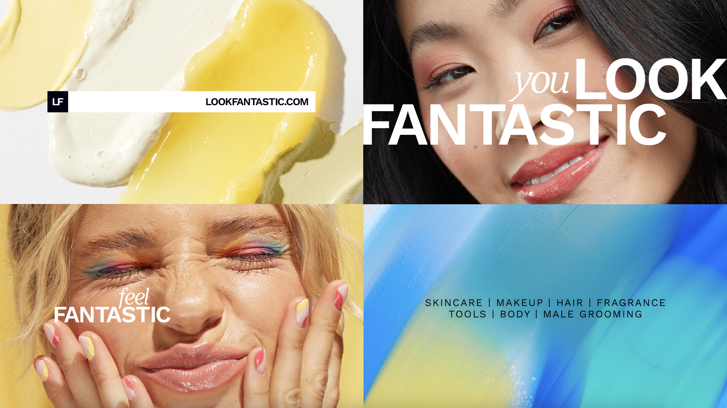
Key elements of the refreshed guidelines
TARGETED BRAND FILMS
Each cohort was targeted in specific ways, resulting in tailored edits specific to the focus demographic.
Click each to play
APPROACH TO TYPOGRAPHY
As part of the refresh we took a new approach to type, pairing the beautifully editorial Argesta with the functional Work Sans to create a perfect pairing. Below shows examples of how both fonts can be utilised individually & together.

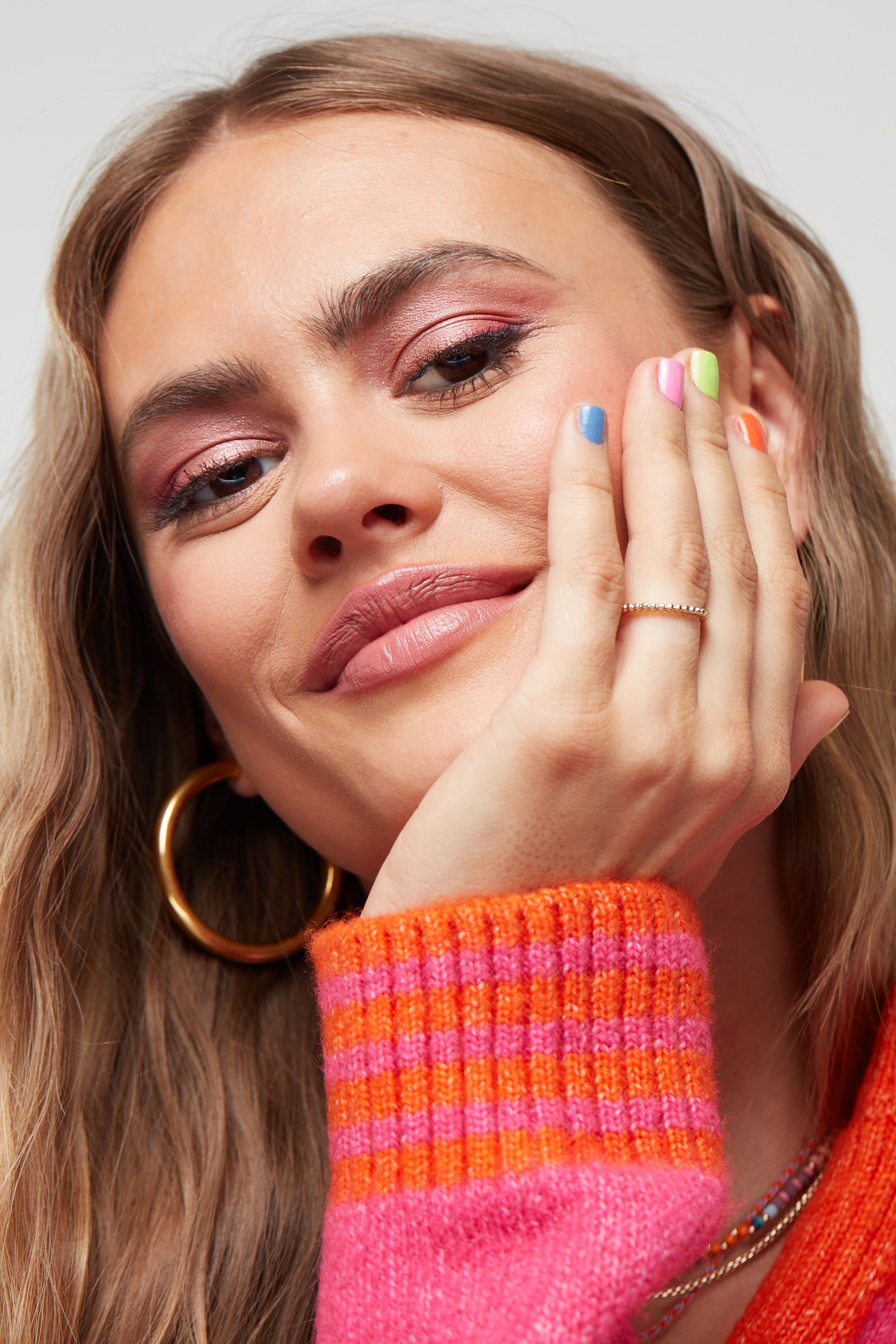
MODEL CREATIVE
The faces of LOOKFANTASTIC are key in resonating with the customer base. After extensive research 3 cohorts were discovered. Generation Trend 18-24, Practical Luxe 25-35 & Quality Demander 45+. With the cohorts in mind we then set out to cast a diverse range of women. Each model shot 2 looks, one skincare based and the other with a colour cosmetic focus.








VIDEO DEVELOPMENT
Below are key style frames for the cohort specific video edits. These utilise collateral from the swatch & product shoots as well as the model assets. The colour usage & design elements across each differed to appeal to each demographic individually whilst still remaining grounded in LOOKFANTASTIC’s visual DNA
EMAIL DESIGN
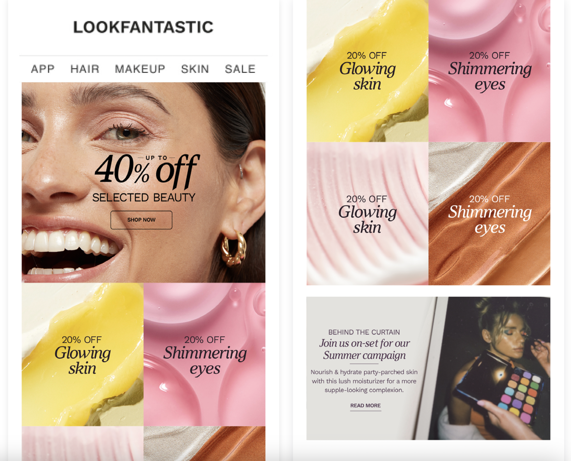
LOOKFANTASTIC sends a fair few emails out to it’s customer base, so as part of the brand refresh we looked at streamlining the design of content sends & bringing in specific design elements to target the key cohorts.
GENERATION TREND CONTENT SEND
This email utilises specific model imagery as well as an intense poppy colour palette to resonate with the younger demographic. Products & brands included in this send will be pulled from data that also links to this demographic
QUALITY DEMANDER CONTENT SEND
This email utilises specific model imagery and a diverse colour palette to resonate with the older demographic. Products & brands included in this send will be pulled from data that also links to this demographic.
GENERIC CONTENT SEND
This email utilises swatches, model shots & polaroids to resonate with all cohorts.
PRACTICAL LUXE CONTENT SEND
This email utilises specific model imagery and a more muted colour palette to resonate with the mid range demographic. Products & brands included in this send will be pulled from data that also links to this demographic. The design utilises a more editorial feel
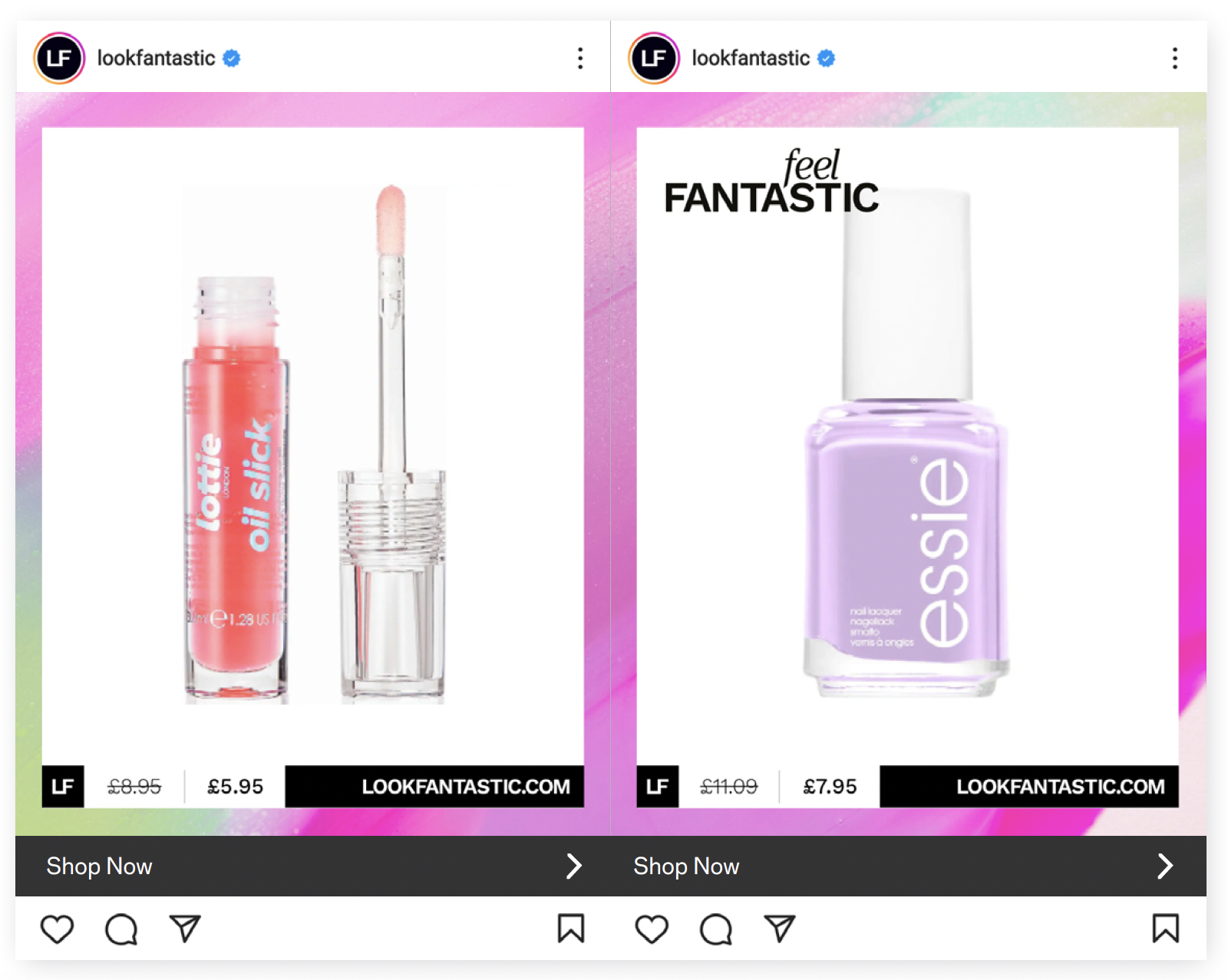
SOCIAL MEDIA approach
Social media is a driving force for building & maintaining a brand aesthetic. Often social media is very reactive though and doesn’t always allow for entirely bespoke creative, our answer to this was to provide template based designs that can be dialled up for specific cohorts or activations.
SALES ACTIVATIONS
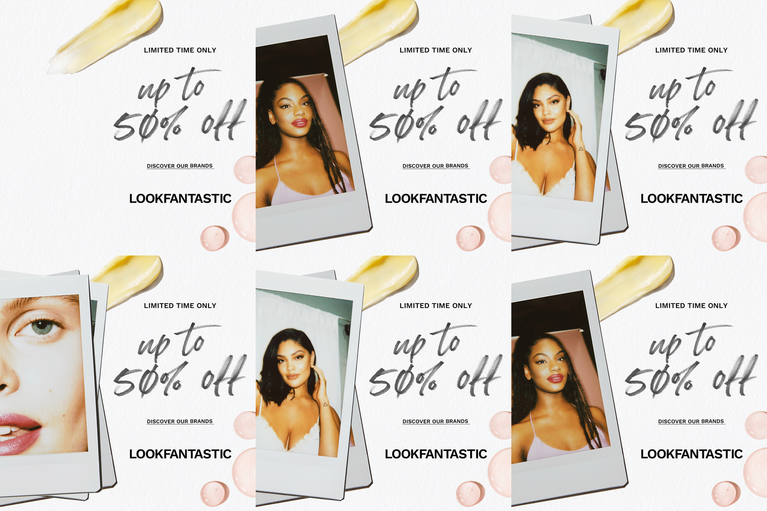
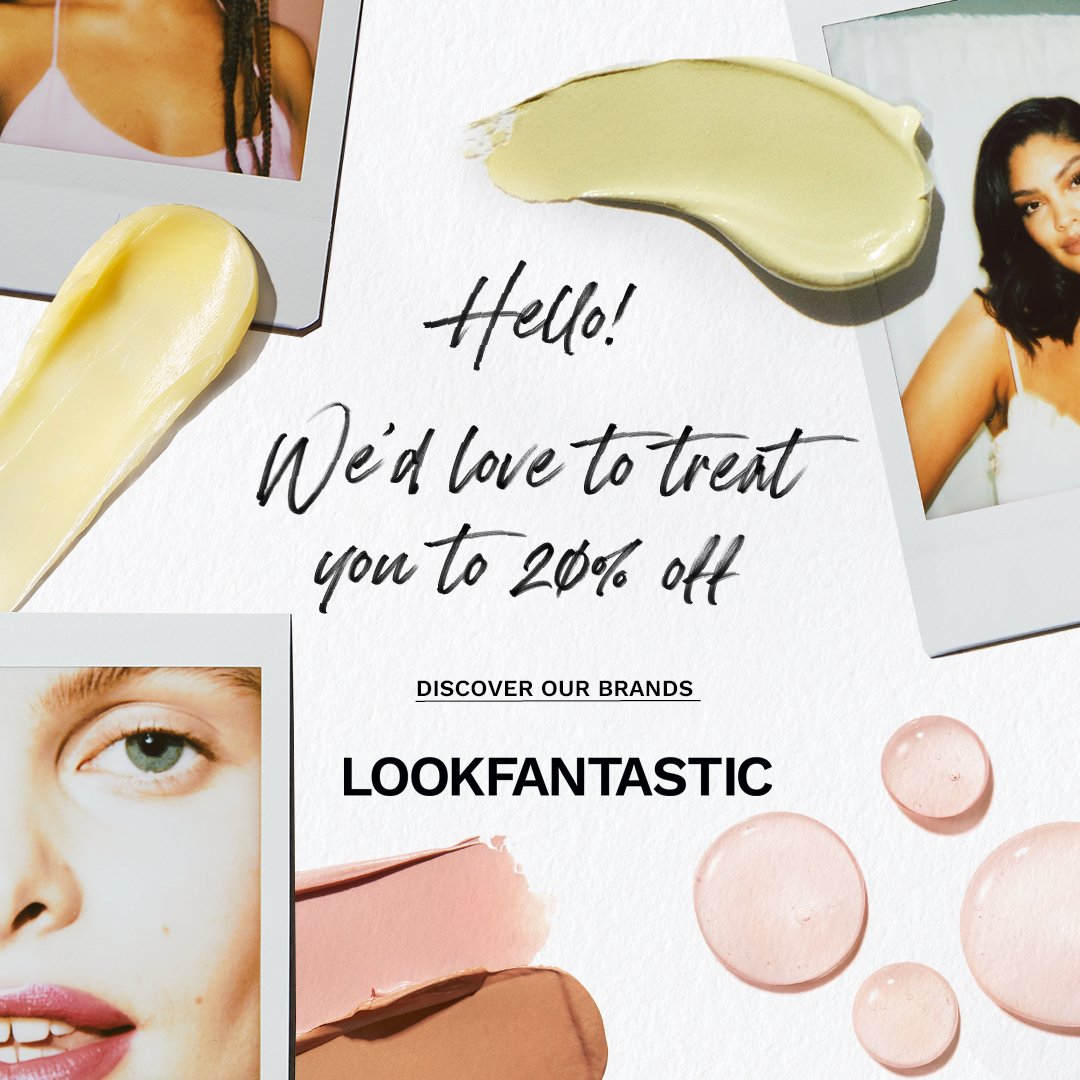
LOOKFANTASTIC is a sales driven business, the need for always on sales assets that are engaging and recognisable was a key part of the ask. We provided a refreshed & refined look at sales assets that remained on brand & aspirational. Utilising tactile elements such as polaroids and the introduction of envelopes to create the sense of an exclusive & personal invitation to sale moments.


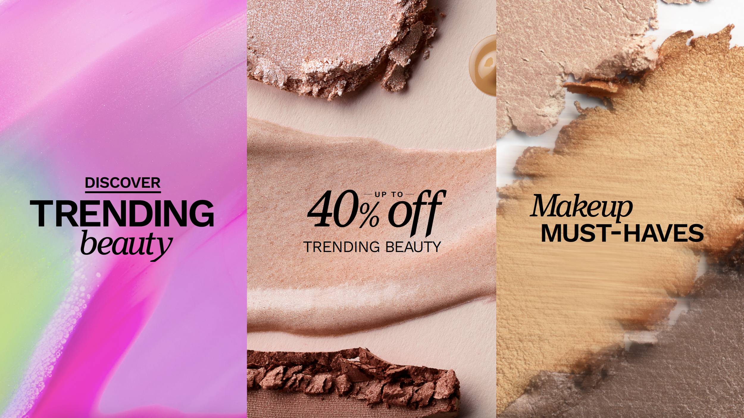
PRODUCT PHOTOGRAPHY STYLES
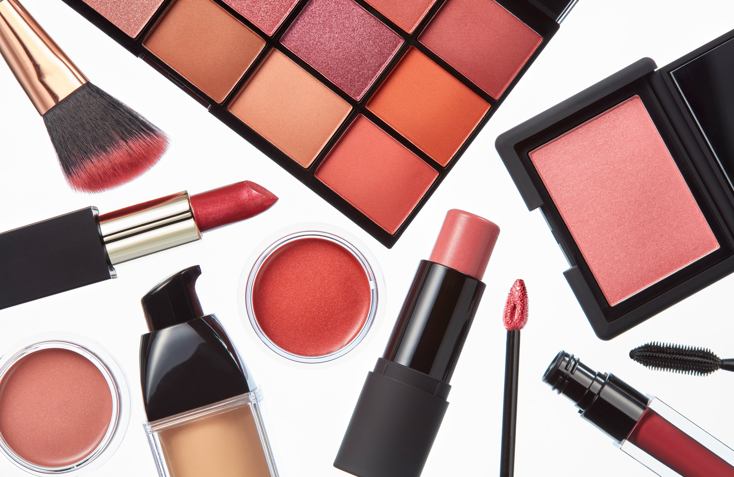
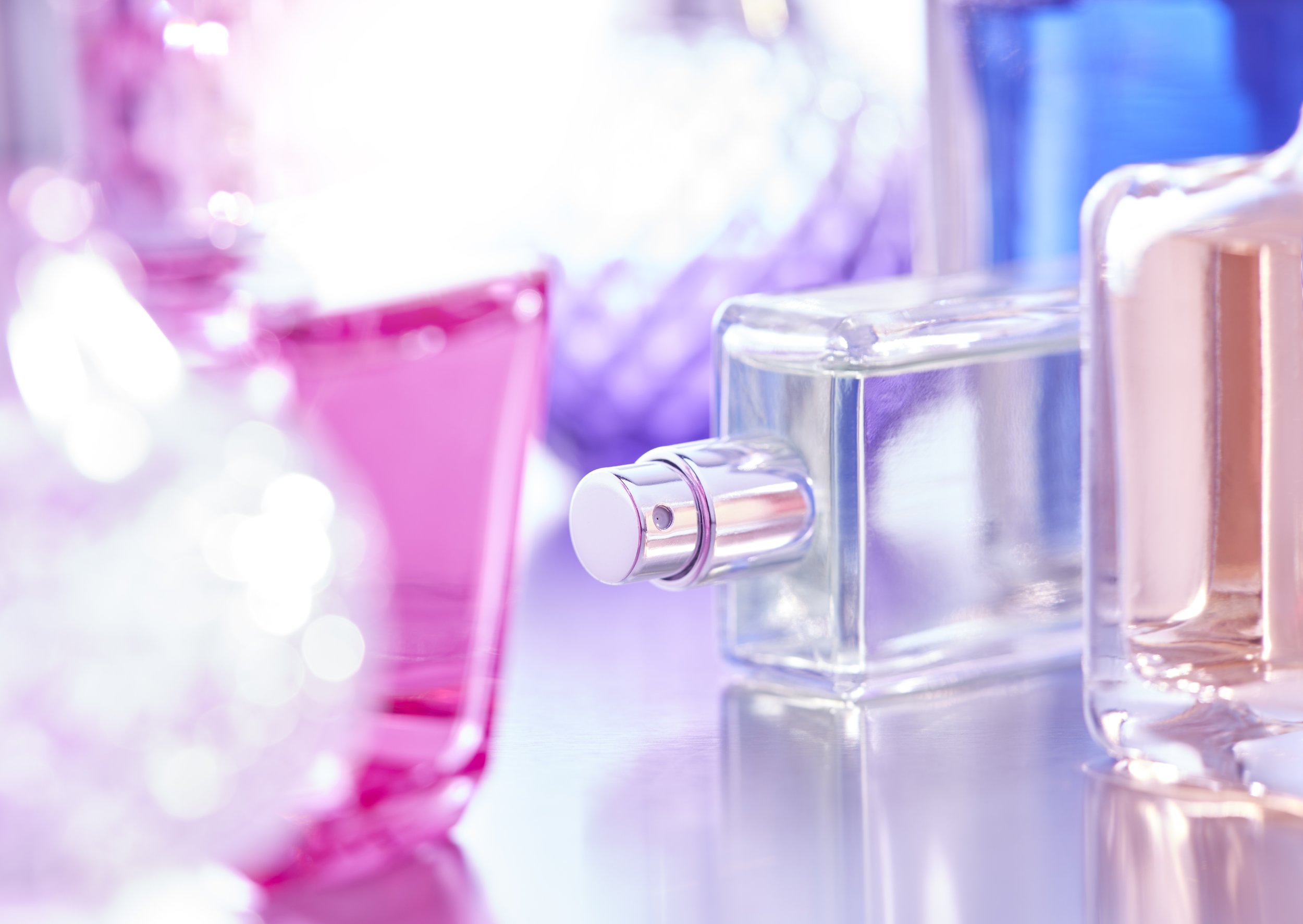
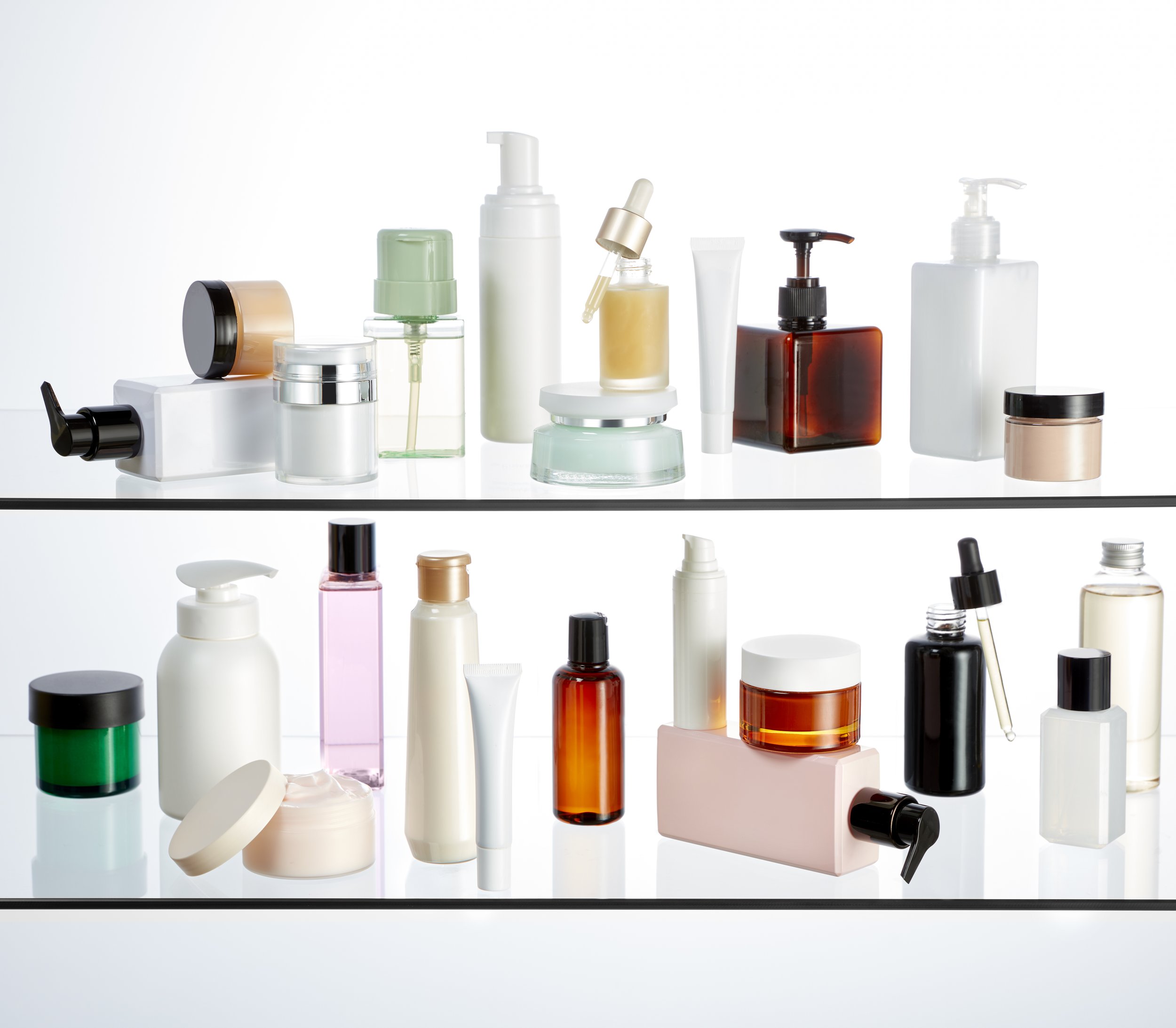
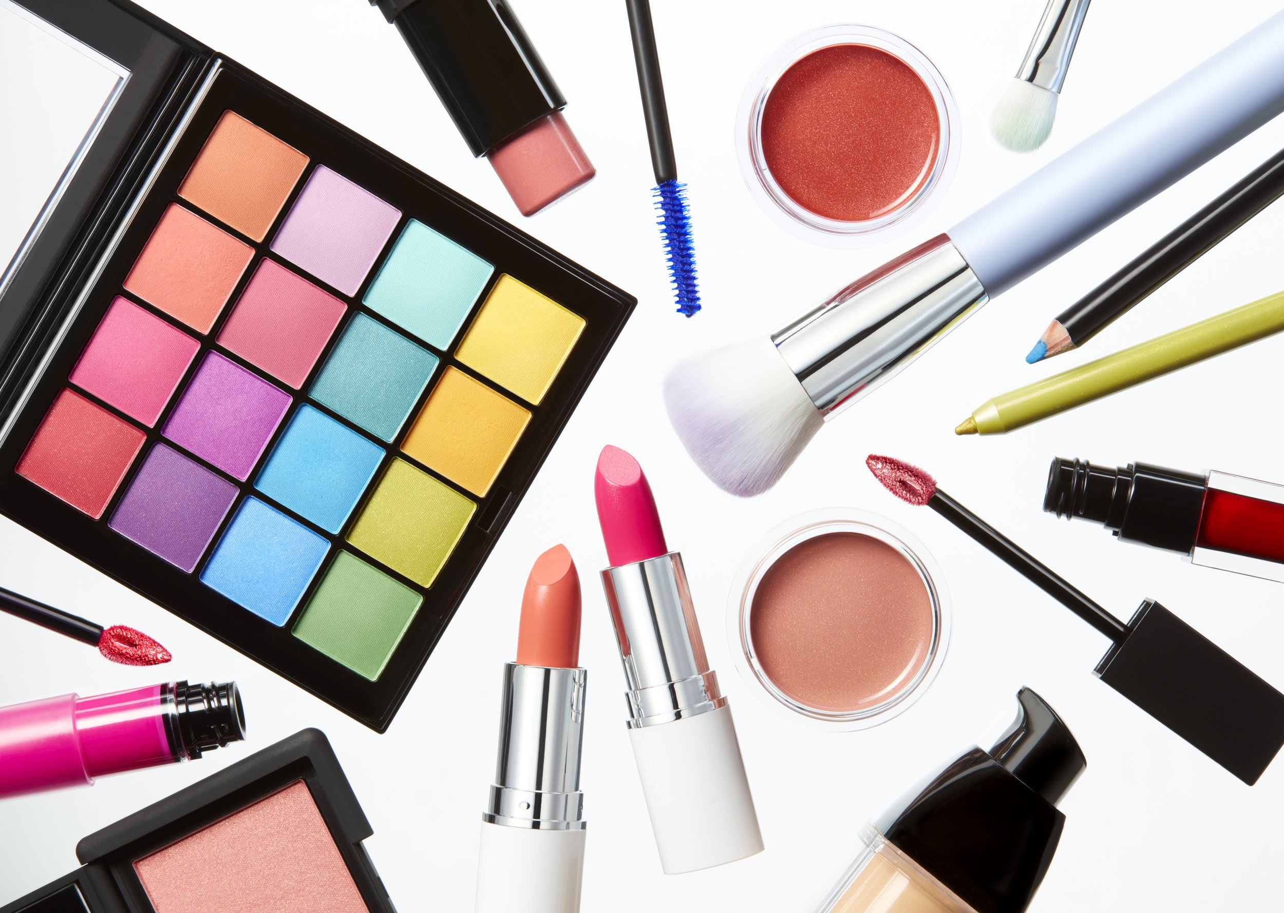
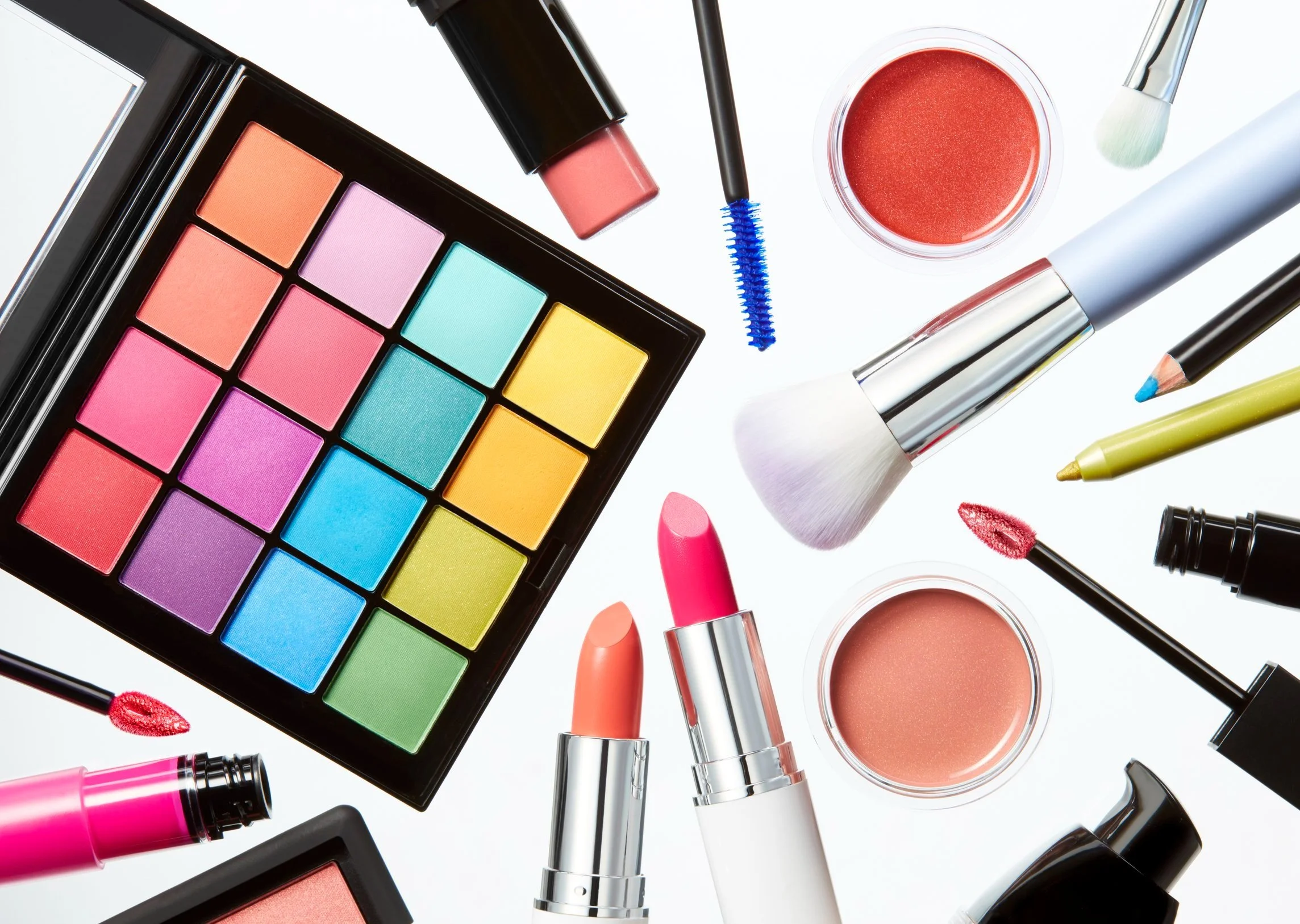
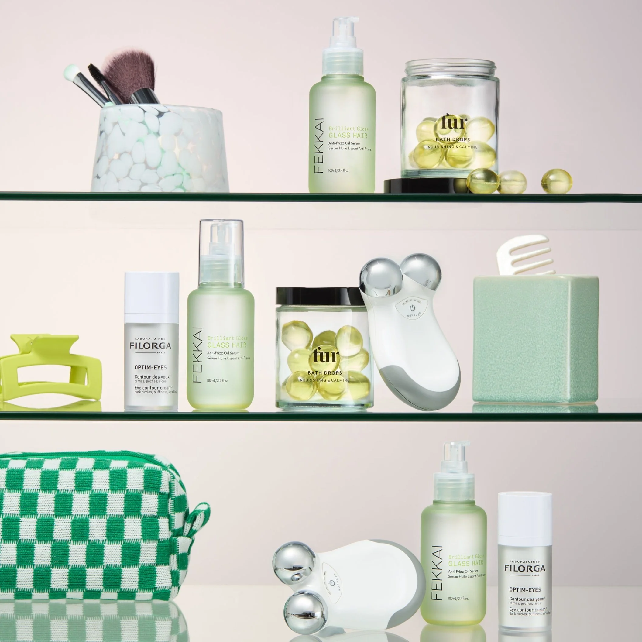
Product photography is shot regularly to keep up with trends & new in product. This created a need to come up with styles in which photography could have themes allowing sets to evolve to create an element of recognisability whilst still able to be refreshed. Themes created were - The Shelfie, Shadowplay, The Bathroom & Trending Beauty.


ABSTRACT PHOTOGRAPHY
Abstract product photography was created to help give LOOKFANTASTIC a sense of self. As a retailer the brand often relies on provided assets, but in the event of a sale or category event it’s important to add an element of ambiguity within the imagery. This imagery is playful, colourful and really versatile.
