Pevonia Branding Propsal
CREATIVE / ART DIRECTION
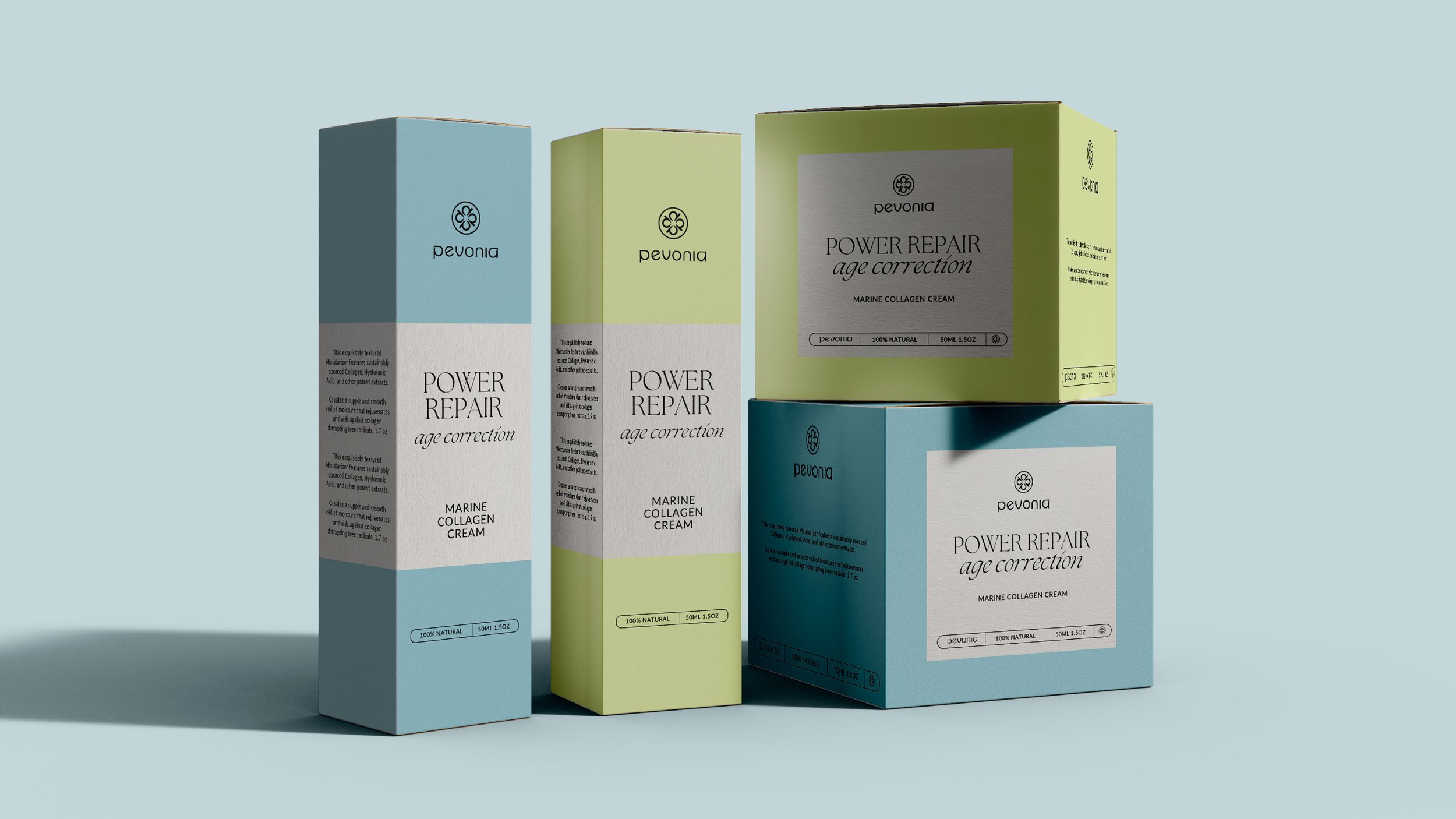
This project was to work with a new creative client in refreshing their look & feel. The main nask was to deliver an informative & premium brand aesthetic that felt cohesive to their brand positioning in the luxury spa market.
Please note images are currently reference
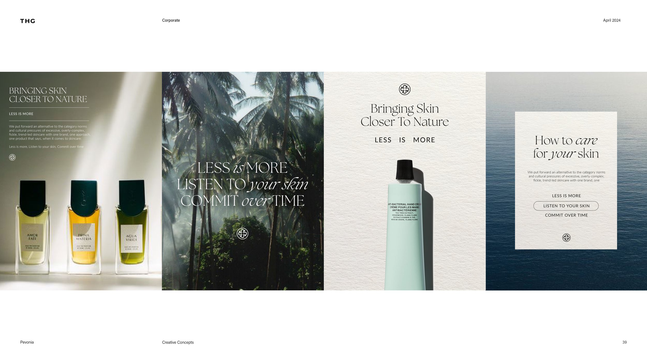
Bringing skin closer to nature
This creative positions Pevonia as a hyper premium brand that acts as a natural alternative to it’s technological and ingredient focused competitors.
The key sentiment behind this route is the ‘less is more’ philosophy. The look and feel of this route is a simple and singleminded approach, utilizing simple design structures to guide the customer on an educational journey to connecting with their skin in a natural way.
Colour
Building on the existing foundations of the brands colour palette, these have been given a fresh look. By taking reference from natures colours we can begin to form the brand palette with fresh natural pastel hues.

Typography
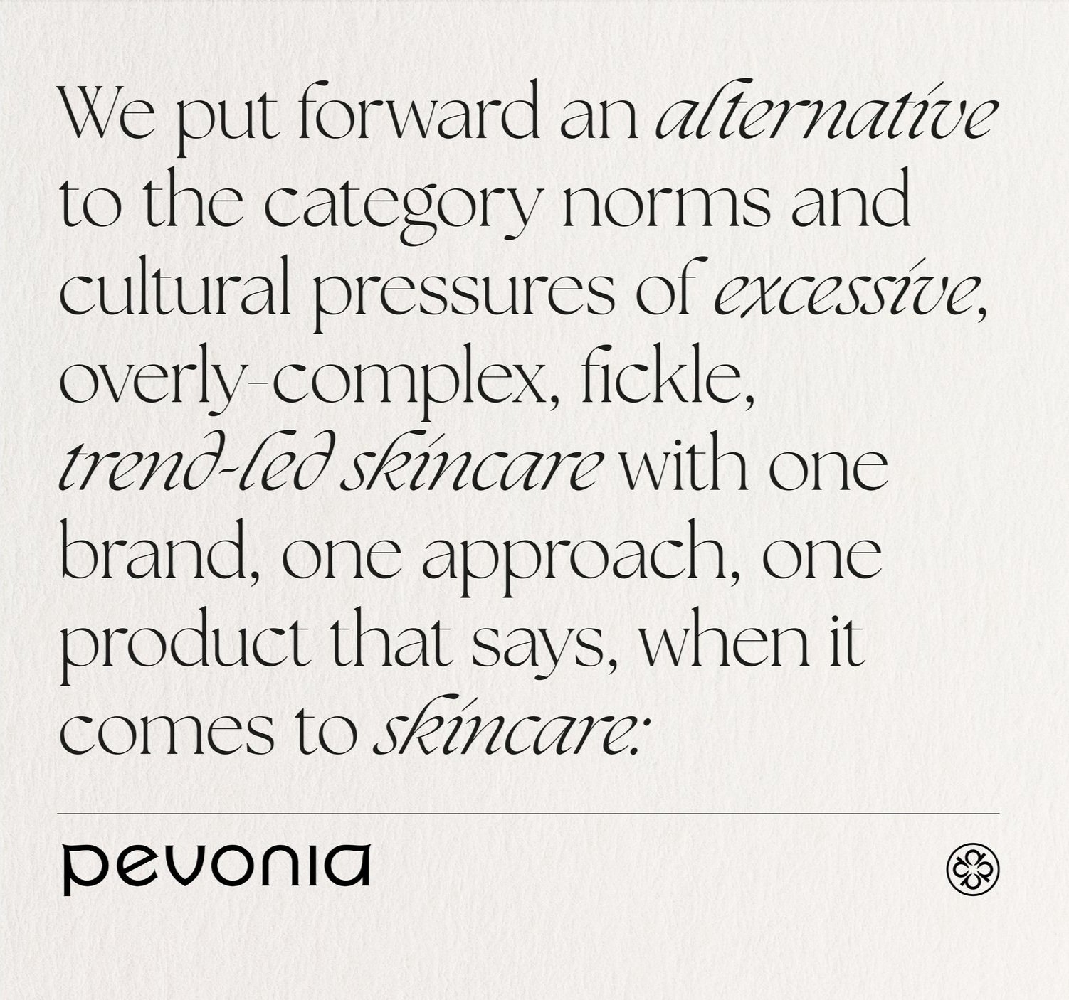
Quite a classic take on typography, balancing a serif & sans serif together to create a dynamic brand visual. We have utilised existing brand fonts but have reformatted the hierachy in which they are used to give an editorial look & feel.
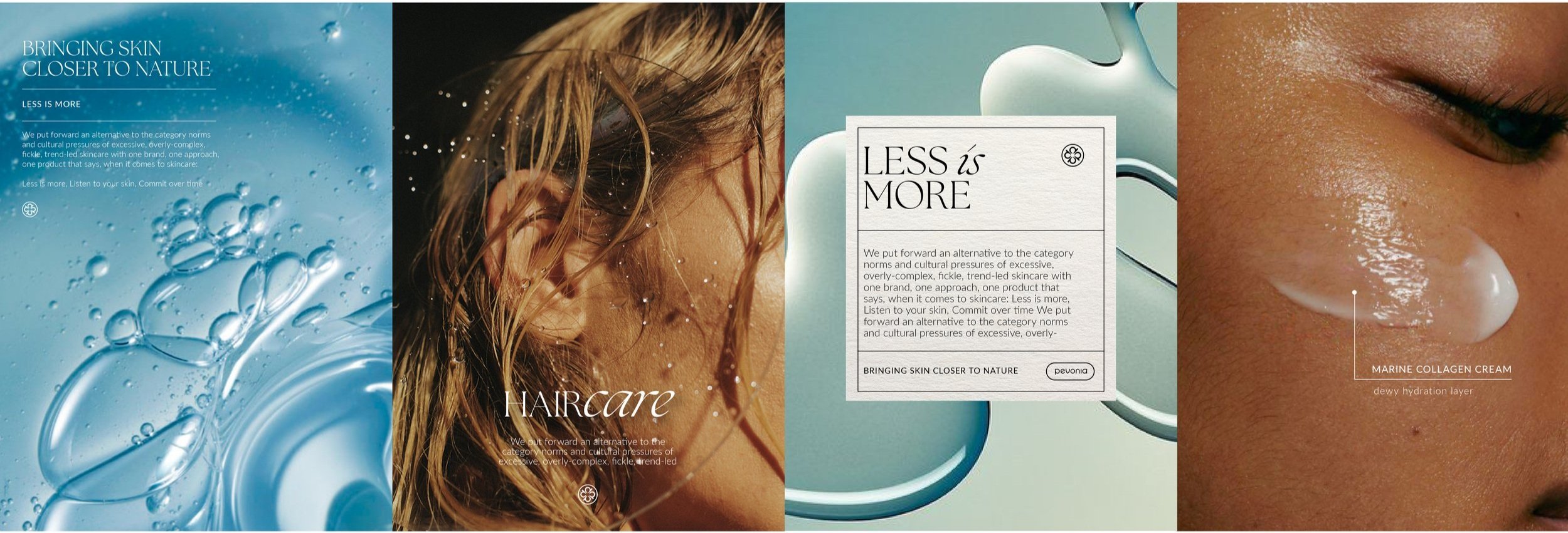
Design execution examples
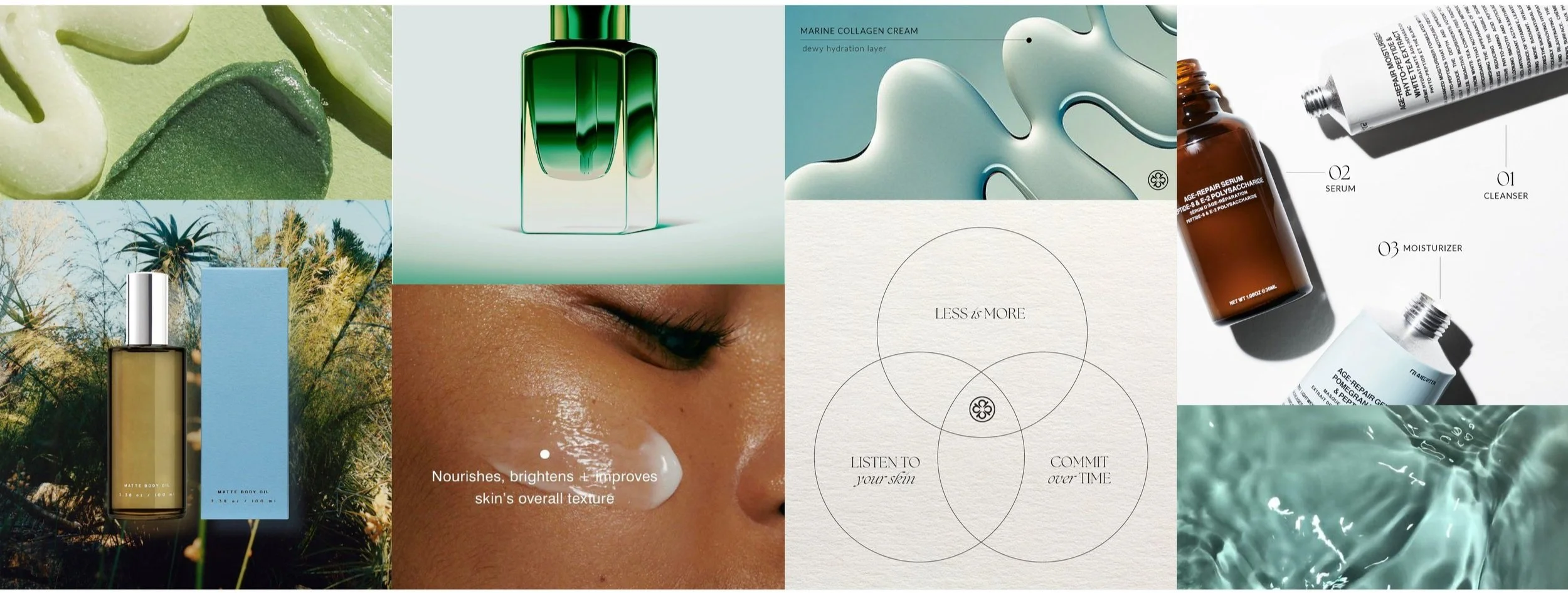
above & below are examples of how the brand creative will come together. Model & swatch photography will form a staple of the creative look & feel, with editorial style typography & annotations.
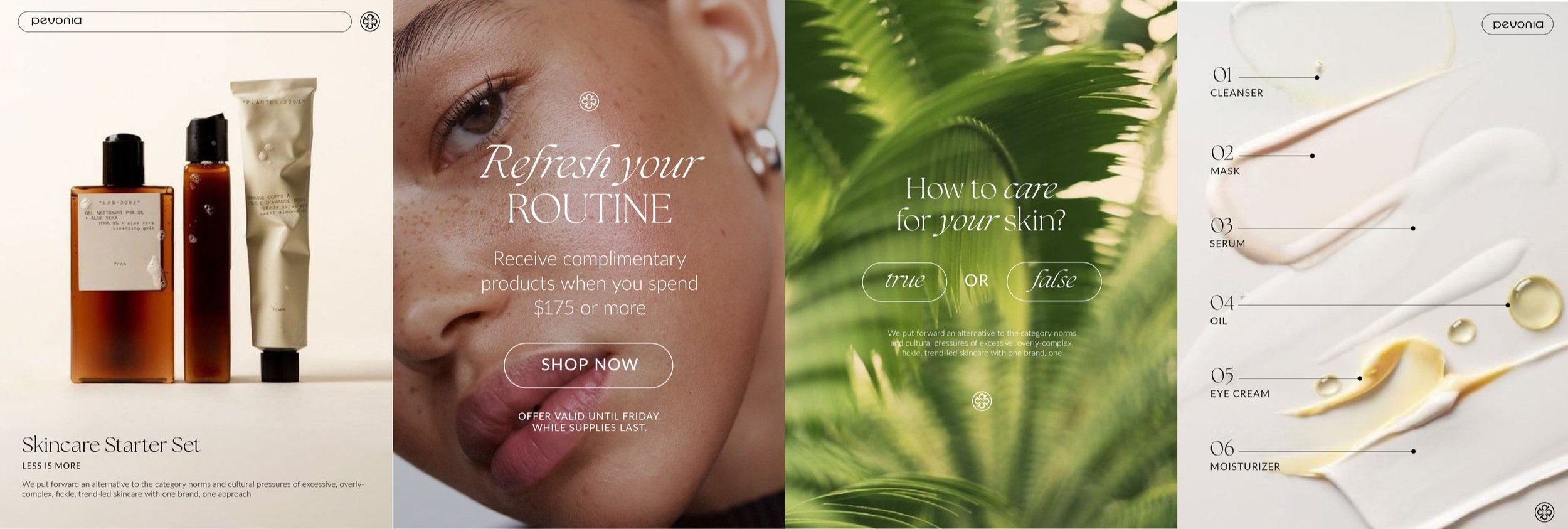
Design execution examples
utilising nature stock photography will be a basis of the brand, reaffirming the brand vision. The focus of the brand is to guide the customer on an educational journey, utilising swatches & annotations as well as informative language and quizzes
Website Design
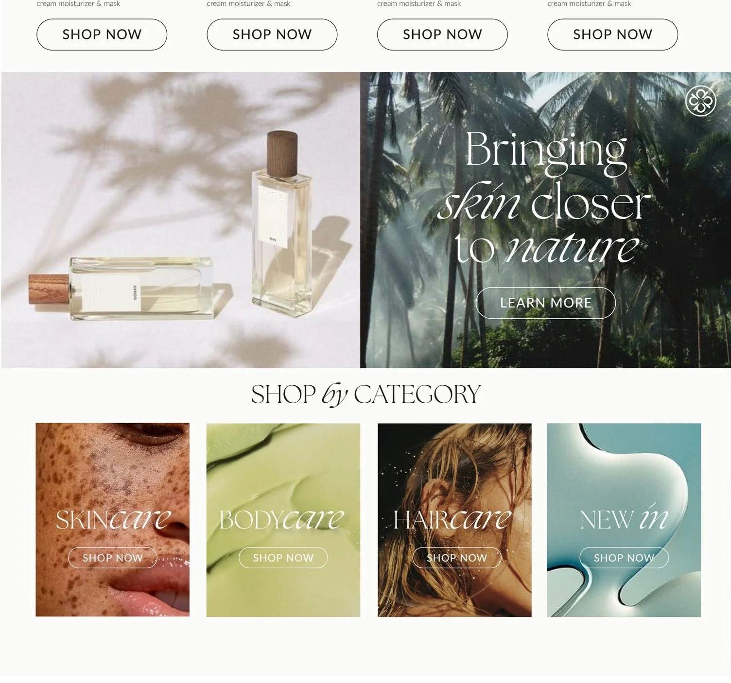
The aim of the homepage is to provide a clear vision for the brand.
Customers will land and immediately be greeted by informative banners, and easy to shop product line-ups.
Main banners will vary between swatch, model, product & stock imagery to give a well rounded look & feel for the brand that positions Pevonia as an informative, educational voice in the skincare market.Alternative banner options can be seen further in the deck that work to creative image pairings.
The bestseller section provides quick access to the brands prime products, giving customers an insight into the brand.
Secondary banners talk to secondary messaging, but should prove as a balance to the content on the main banner. These may house brand manifesto messaging, to reinforce the vision for the brand to customers
Shop by category is a great inclusion as it focuses a customers search, providing a more skin-centric approach to the shopping experience. The approach shown, would be an option we could launch with, with the addition of swatch photography.
Single product pages
Single product pages will form a really informative & educational hub for each product. They will hold brand sentiments as well as upselling product & informing customers of the routine in which each product is situated
Product images will be simple, with secondary images utilised in the carousel consisting of swatches & model/skin shots showing product in action.
Secondary widgets will talk to product ranges and routine step by step information as well as key brand messaging
Here we can show further educational content to engage with customers and provide a clear and cohesive shopping experience, making sure customers are making informed purchases.
We can also show where products sit within a routine, to further simplify the customer experience. And then detail products that pair well, upselling product in a very considered and informed way.
Social design
The social feed should be a calling card for the brand, it will balance all photography and design styles to really show the brands look & feel.
Social will be used as an educational hub, discussing about product benefits, new product launches & brand manifesto’s
